Customize Consent Preferences

We use cookies to help you navigate efficiently and perform certain functions. You will find detailed information about all cookies under each consent category below.

The cookies that are categorized as "Necessary" are stored on your browser as they are essential for enabling the basic functionalities of the site. ... 

Always Active

Necessary cookies are required to enable the basic features of this site, such as providing secure log-in or adjusting your consent preferences. These cookies do not store any personally identifiable data.

No cookies to display.

Functional cookies help perform certain functionalities like sharing the content of the website on social media platforms, collecting feedback, and other third-party features.

No cookies to display.

Analytical cookies are used to understand how visitors interact with the website. These cookies help provide information on metrics such as the number of visitors, bounce rate, traffic source, etc.

No cookies to display.

Performance cookies are used to understand and analyze the key performance indexes of the website which helps in delivering a better user experience for the visitors.

No cookies to display.

Advertisement cookies are used to provide visitors with customized advertisements based on the pages you visited previously and to analyze the effectiveness of the ad campaigns.

No cookies to display.

Drawing of a paintnrish, a pen and a pencil

Place Life Colour

art by Amanda Earlam

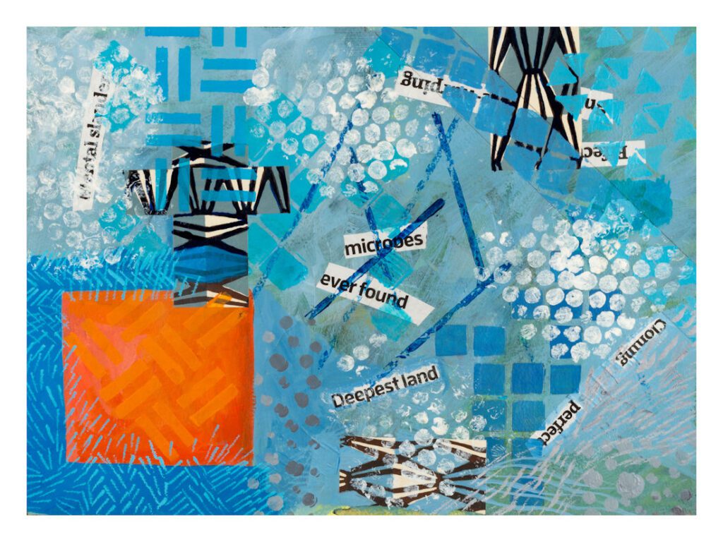
Blue abstract with an orange square

Abstract, some pure some not

These images are mostly a mixture of materials and influences. Some are ink and watercolour, made in a sketchbook. Some are acrylic and collage and arose from work done with Karen Stamper on her Free Up Your Sketchbook and Grow course. Examples of this are the Waterfall and Undersea images.

Others, such as the Pink bricks and Red ellipses images, came from a day of painting a large piece of watercolour paper out in the garden, then tearing it up and working into each piece separately.

Two, Pink square and Orange and blue, started off as a play between two colours.

I love Abstract work, but then I also love fantasy and even consider that there is quite a lot of abstraction in any rendering of the real world into
2D space.

If you page down, you will come across two images which are kind of split impressions of a place.

It’s interesting that some of these works, which started out as pure explorations of shape and colour, end up looking very much like real things. “Waterfall” and “Undersea” are good examples.

Pure abstract

Starting from reality

Abstraction

This was another of Tracy Verdugo’s ideas. To take a photo (in each case one of mine) and choose four areas of it to remake in a more abstract way, dealing with forms and colours, always my favourite part of any art practice!

I’m afraid the Honeysuckle painting suffers from not being a professional photograph. But the original is already framed and in its new home.
error: Content is protected !!