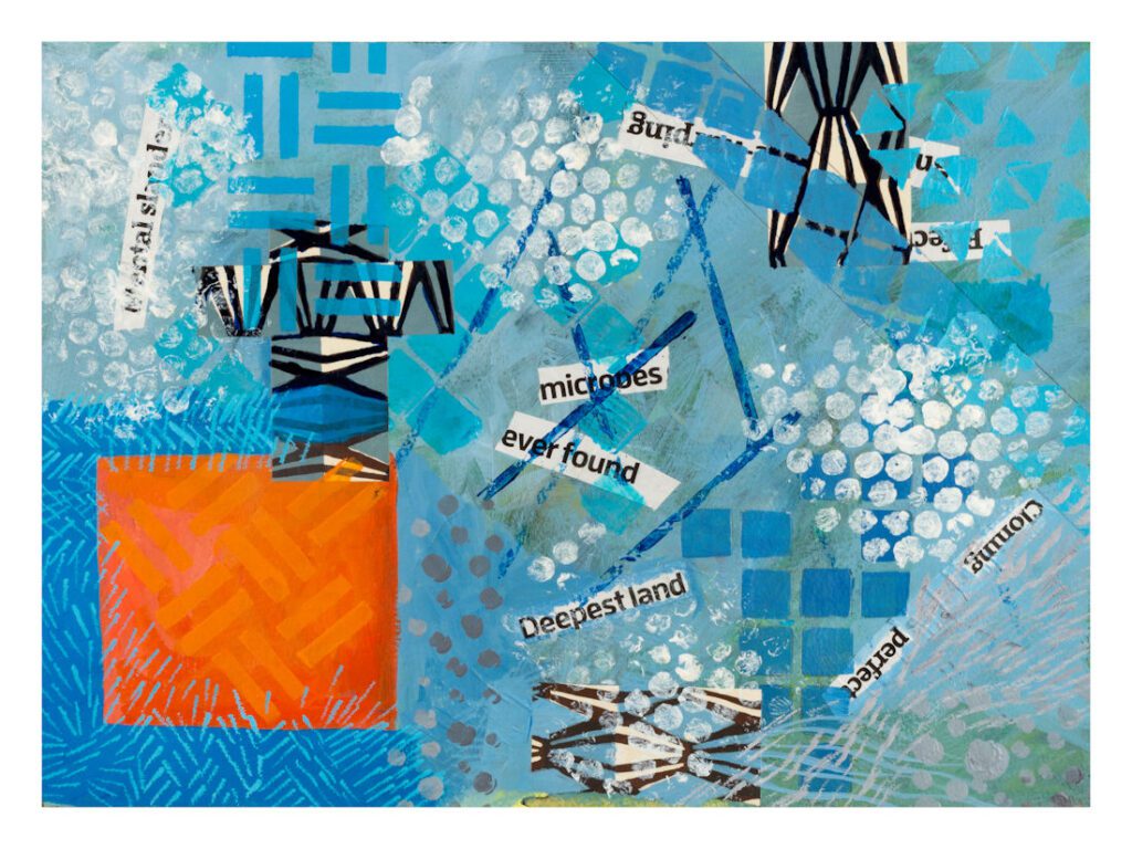
Abstract, some pure some not
These images are mostly a mixture of materials and influences. Some are ink and watercolour, made in a sketchbook. Some are acrylic and collage and arose from work done with Karen Stamper on her Free Up Your Sketchbook and Grow course. Examples of this are the Waterfall and Undersea images.
Others, such as the Pink bricks and Red ellipses images, came from a day of painting a large piece of watercolour paper out in the garden, then tearing it up and working into each piece separately.
Two, Pink square and Orange and blue, started off as a play between two colours.
I love Abstract work, but then I also love fantasy and even consider that there is quite a lot of abstraction in any rendering of the real world into
2D space.
If you page down, you will come across two images which are kind of split impressions of a place.
It’s interesting that some of these works, which started out as pure explorations of shape and colour, end up looking very much like real things. “Waterfall” and “Undersea” are good examples.
Pure abstract
Starting from reality
Abstraction
This was another of Tracy Verdugo’s ideas. To take a photo (in each case one of mine) and choose four areas of it to remake in a more abstract way, dealing with forms and colours, always my favourite part of any art practice!
I’m afraid the Honeysuckle painting suffers from not being a professional photograph. But the original is already framed and in its new home.