Place Life Colour
art by Amanda Earlam
If this is all a bit too much text, you can just skip over to my Instagram feed and see what I am up to in pictures. This website is all about the pictures after all.
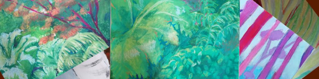
I have never been in the habit of painting plants. Or landscapes, to be honest. Which is odd because I love plants, trees, flowers, forests, green valleys, all that stuff. I also love using and making green paint. Hooker’s Green is a good all-round colour, Sap Green is very bright, Phthaloes are, whoo!, way too intense for use on green nature straight out of the tube. I enjoy adding Lemon Yellow or some variant of Hansa or Cadmium Yellow to these colours to brighten them up or calm them down. I enjoy making them from scratch with Phthalo Blue or Teal. Ultramarine also works in a more muted way. I am learning to appreciate a tiny touch of warm or cool red to calm the whole thing own and make shadows. I doubt I shall ever apprecaite Oxide of Chromium. By the way, I love that you can now get to know the pigment numbers of colours and look them up on nerdy websites. Fantastic. On the other hand, cheaper paints such as Arteza or Amsterdam make great geen (and other) mixes that I would not have got round to thinking of myself. Making swatches is also a great way to explore different hues.
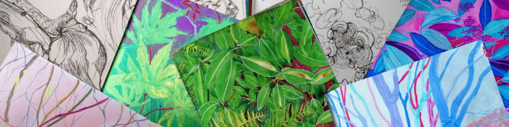
I am filling the pages of a square sketchbook which started off with Story Painting research. I have turned to the back and started again. I am using a Lamy pen because I love it and I seem to have forgotten what a pleasure drawing is. I am using gouache because I want to get to know it better, and watercolour because we all love those clear, shining colours. My sketchbook probably won’t contain acrylics this time. Two reasons, one because I really dislike the way adjoining pages covered in plastic paint will stick together, two because in the fullness of time I shall use these sketchy paintings as resource to make some paintings on canvas board and wood (I’ve already bought them, all square!) and I shall use acrylic on that surface.
I am trying (am I succeeding?) not to get into too much detail in my sketches. If it looks like I have done a complete painting in the book, then it might well bore me to “reproduce” it as a “real” work. And that would be bad, as I am not going to rip these pages out. They’re only cartridge anyway and the painted ones are pretty wrinkley.
It’s odd that many artists profess to hate green. At least I find it odd. Maybe they know something that I don’t. Like, perhaps way too many green nature paintings turn out harsh and unnatural. Maybe. I know that pigments are not real life. Honestly.
My inspiration for these works was initially our summer trip to Seattle last year and our time spent in the amazing Arboretum there. Gorgeous place. On the other hand, we have Anglesey Abbey, Ickworth, Sheringham Park, Wicken Fen and lots of green things in Ely to look at. Small things and large things.
I do occasionally break out of the green thing and recolour something in red, pink, blue and purple. I can’t stop myself.